Charts and graphs are essential tools for visualizing data, revealing trends, and making complex information more accessible. In the realm of finance, especially in tracking commodities like silver, these tools are invaluable. They provide a clear view of market movements, helping investors, analysts, and researchers understand historical patterns and make informed decisions. This article will explore different types of charts and graphs, with a particular focus on spiral charts, and conclude with insights on the significance of silver-related charts and graphs.
Spiral Chart
A spiral chart is a visually engaging way to present data that changes over time or across cycles, such as months or years. Instead of moving linearly across a horizontal or vertical axis, data in a spiral chart moves in a circular or spiral path, often with multiple layers to represent different time periods or categories.
In finance, spiral charts can illustrate seasonal patterns, cyclical trends, and long-term data in an intuitive way. For example, a spiral chart for silver prices could reveal recurring annual or monthly patterns, showing how prices tend to fluctuate during certain times of the year. This can be helpful for analysts or investors looking for seasonal buying or selling opportunities.

Key Uses of Spiral Charts
- Cyclical Data Representation: Spiral charts help visualize patterns that repeat, making them ideal for analyzing data across seasons or cycles.
- Comparison of Multiple Periods: Multiple years or categories can be layered to see trends across various timeframes.
- Focus on Long-Term Trends: Especially useful in observing gradual changes over a large period.
Chart vs. Graph
While charts and graphs are often used interchangeably, they serve different purposes and offer unique visualizations of data:
Charts
Charts are typically more straightforward and are used to summarize data. Common types include:
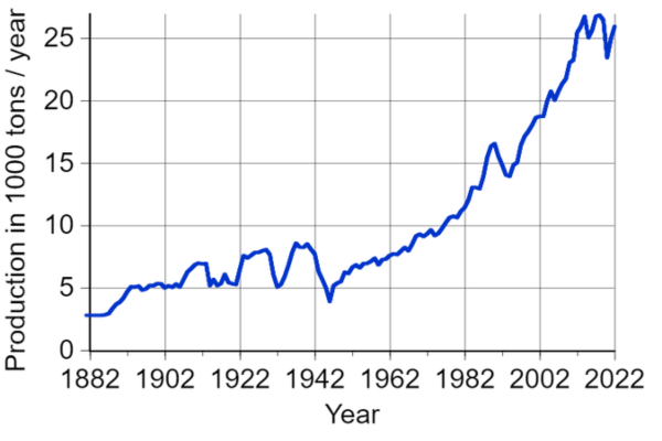
- Line Charts: Show trends over time, making them ideal for tracking silver prices over days, months, or years.
- Bar Charts: Useful for comparing quantities, like production levels or price differences across regions or years.
- Pie Charts: Represent parts of a whole and can be used for analyzing market share in the silver industry.
Graphs
Graphs tend to be more detailed, often involving coordinates and relationships between multiple variables. Examples include:
- Scatter Plots: Show correlations between variables, such as silver price and inflation rates.
- Histograms: Useful for analyzing frequency distributions, like the frequency of specific price ranges for silver.
- Network Graphs: Highlight relationships, for example, between silver prices and other commodities like gold or copper.
Charts and graphs each offer unique advantages, and choosing the right type depends on the data’s nature and the story you want to tell.
Conclusion on Silver Charts and Graphs
For those interested in the silver market, charts and graphs are indispensable tools for understanding price trends, market cycles, and potential investment opportunities. Historical silver charts can reveal how prices react to economic changes, inflation, and geopolitical events, providing insights that help investors anticipate future movements. Whether you’re using a spiral chart to observe cyclical price changes or a line chart to track long-term trends, these visual tools offer clarity and depth in analyzing silver and other financial assets. By selecting the right chart or graph, investors can turn complex data into actionable insights, making charts and graphs a fundamental aspect of financial analysis and decision-making.
